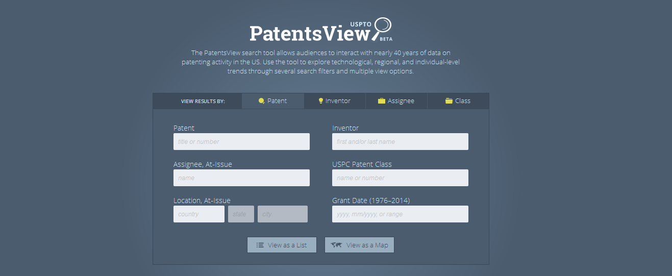
Last Week, USPTO launched a new tool Patentsview.org to visualize the patent data of past 40 years (1976-2014). Its development is a part of Barack Obama’s plan that began in 2012 and aims to increase the value, utility and transparency of US patent data.
To develop PatentsView, USPTO collaborated with USDA, the Center for the Science of Science and Innovation Policy, the University of California at Berkeley, Twin Arch Technologies, AIR, and Periscopic.
Though, it brings advantages like elimination of wasteful cleaning of data along with it. But, at the same time, it has some serious disadvantages. Both of which we have tried to come up for our readers below.
3 Areas Where PatentsView is a Hit
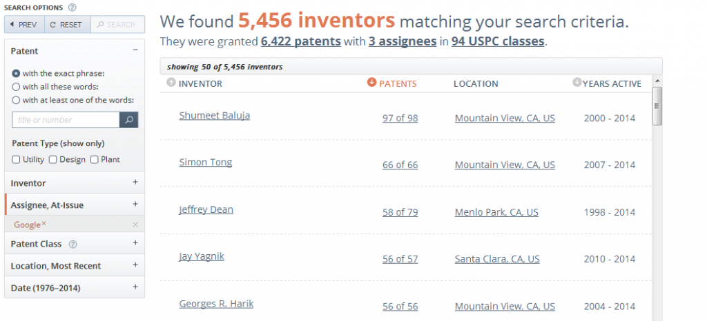
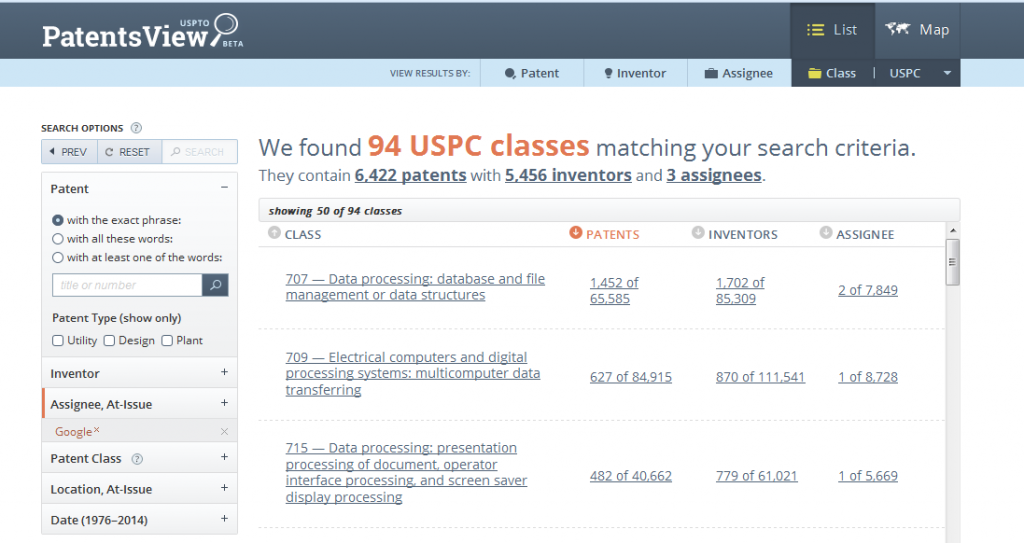
1. Top Inventors, Top Classes Are Just a Click Away
Earlier, to find who the top inventors are from a particular company or which are the top classes they are filing patents in, you had to go through multiple steps; for example, downloading the data, organizing it as per the classes/inventors, etc. and then deriving the insights.
That pain, to a great extent, has been eliminated by the PatentsView that returns the top inventors or top classes with just a click of a button. For example, I tried finding the top classes are inventors from Google and it returned with following results that took just few minutes of mine.
Though, the information is good; but, we are trying to figure out the usefulness of the feature.
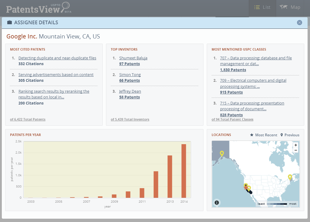
2. Assignee Details
Among other, the best feature of PatentsView is its comprehensive assignee details. It presents a user with a great amount of detail, on a single screen, in a lucid manner.
For example, when I selected Assignee from tab beneath the header, I was presented with a screen showing:
- Top three most cited patents,
- Top three most mentioned UPSC classes,
- Top three inventors,
- And innovation timeline of Google
As this information provides a bird eye view of all the competitors to an executive, it can, hence, become vital for him in making crucial decisions before entering to a board meeting.
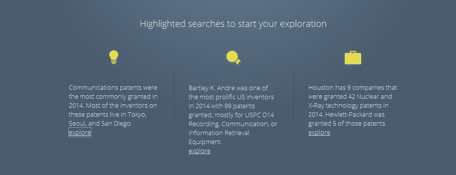
3. Some Interesting Insights Driven from Patents
Did you know that communication patents were most commonly granted patents of 2014? And Bartley K Andre was the most prolific inventor of last year in the US?
These are the insights provided right beneath the search box on PatentsView.org.
This information looks more useful for journalists and bloggers as compared to researchers or businesses. However, if USPTO provides some additional insights explaining the whys of the stats then, in the future, it can become popular among businesses.
3 Areas Where PatentsView is a Miss
Although the PatentsView has advantages of serving its users with valuable insights; but, like any other analytic platform in beta mode, it has some slips too. We tried to identify some of these slips that you should to be aware of, and provide you with the insights to avoid them.
4. Inaccurate Data Disambiguation
The PatentsView fails to disambiguate the names of assignees, location (city/country/state) and inventors. Though, its algorithm corrects minor mistakes but, links names together that are within a certain bound of similarity.
Apart from that, in PatentsView, searching for patents from a specific inventor is a pain in the neck if his name is quite common or has multiple forms.
USPTO can solve this problem – that exists for years – without much effort as it already has plethora of information regarding inventors. The sad part is that even the commercial tools, like Thomson and Orbit, haven’t been able to find any solution. in our opinion, assigning a unique number for each assignee and inventor can solve the problem once and for all.
5. Searching is Ambiguous and Undefined
Searching in the PatentsView can be ambiguous for you. Moreover, if someone is less knowledgeable about patent filings of a particular company then, the results can mislead him/her if he/she doesn’t bother to cross check the results once.
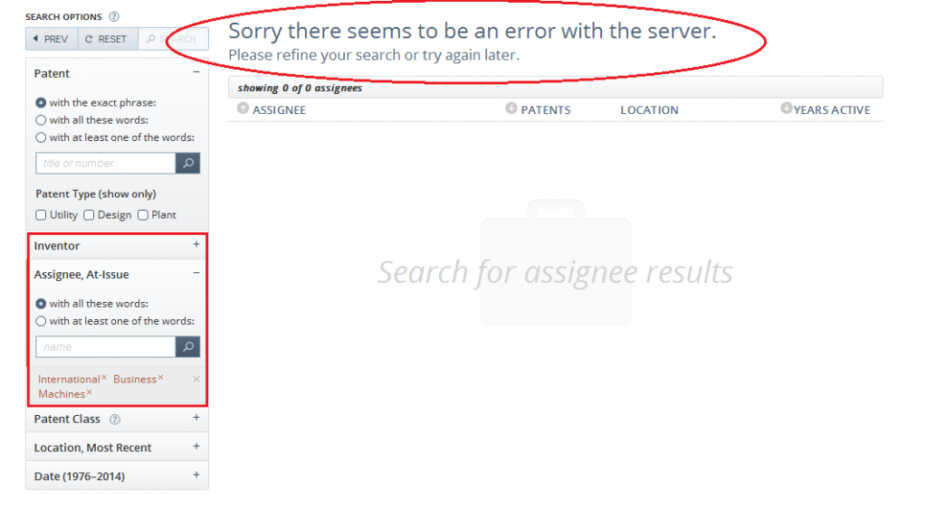
For example, I tried searching for the patents granted to IBM. In the first attempt, I inserted International Business Machine in the search box of Assignee, at issue and checked “with all these words:” among the two options.
PatentsView returned with no results. Have a look at the screenshot. Same was the case when I used inverted commas and inserted “International Business Machines” on the search box.
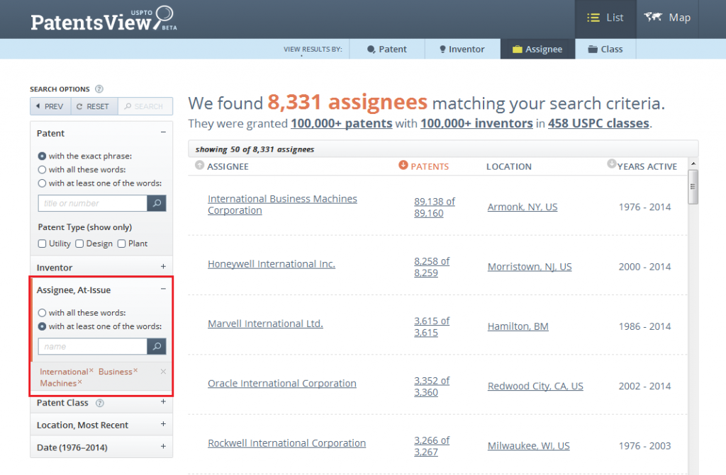
In the next attempt, I checked the second option “with at least one of the words:” This time PatentsView returned with 8,331 assignees with 100,000+ granted patents. Though the results had IBM at top but still it can confuse someone.
In the last attempt, I used underscore instead of space and inserted International_business_machines in the search. This time the PatentsView returned 89,157 patents with 10 assignees that was almost accurate.
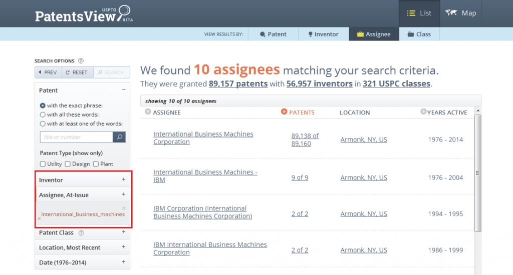
Pro Tip – Use underscore, like I did in the third attempt, and save yourself some pain.
This, to us, seems like a problem that is less related to the search and more related to the user interface.
6. The Map View Can Bewilder You
PatentsView presents result as a list or on a map. You can select anyone among the two from the top right corner. The results I have discussed above were results as a list. After that, I selected results on map to check geographical distribution of IBM’s patent.
PatentsView presented me with 1000 patents out of 89,157, for that matter. There were many small yellow dots sprinkled over the world map. Hovering cursor over these dots popped-up the name of the city and number of patents filed from that location.
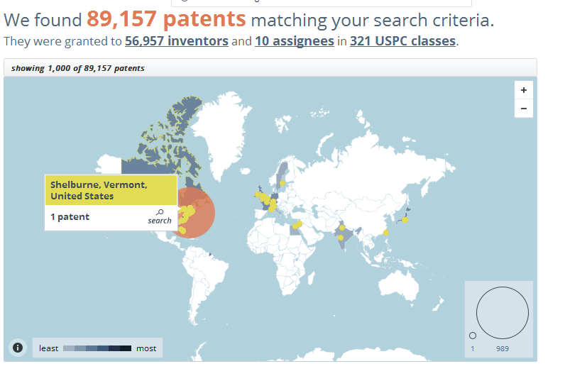
I noticed most of the dots displaying 1, 2, 3 or 10 patents. Adding them up, the count was not even crossing the three digits mark. However, I was served with a data of 1000 patents.
So, where the rest of the data was hidden?
On the bottom right of the map, you will find a circle that represents number of patents it encompasses. And that rang the bell.
I micro zoomed around the red circle. And found a dot, which was representing Armonk, HQ of IBM, on the map, displaying 989 patents.
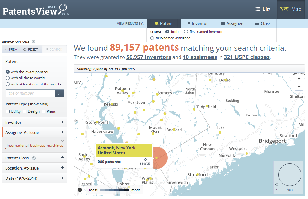
Pro Tip: Micro zoom the map to see the exact number of patents filed from different areas.
This is something that can bewilder a first time user. In my opinion USPTO should display total number of patents per country when a user is served with the world map. And when he focuses on a particular country the number of patents per state should get displayed. And on further zooming, it should display the number of patents per city.
That said, such an organized representation of patents for “results on a map” view will make users less confused and constitute a better user experience.
Nitin Balodi